Pure CSS Icons
An experiment at creating shapes with CSS
Having marvelled at David Desandro’s Opera Logo made entirely in HTML and CSS, I wanted to try a similar experiment for myself. So with a large scoop of border-radius I set about trying to create various ‘common’ icons that could be used in your web apps.
To skip all the explanation and view these icons in their entirety, view the demo here.
CSS3
These icons use lots of CSS3, border-radius being the most obvious but also rotation, gradients and transform (for when an icon is hovered over).
Size?
These icons needed to be functional and useful for the web, so all dimensions are em-based so that all you have to do to change the size of the icon is just change the font-size of their containing element.
Disclaimer
I’m sure its obvious but just to be clear, these icons will not work very well in Internet Explorer.
RSS
My first idea was simply an RSS icon, it seemed easy enough and indeed it was. I created a two variations, one with the traditional orange background and one without.
Heart
Made with just two spans rotated at opposite angles.

iPhone
With a big dose of inspiration from the brilliant Helveticons icon set, I created this iPhone icon. Three spans within one container div.
Microphone
Easily the most interesting icon to code, this icon uses a few more elements than any of the others.
Block
A simple div with a rotated span within.
Triangle
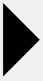
One div that make uses borders to create the illusion of a triangle.
Disc, Target & Mini Target

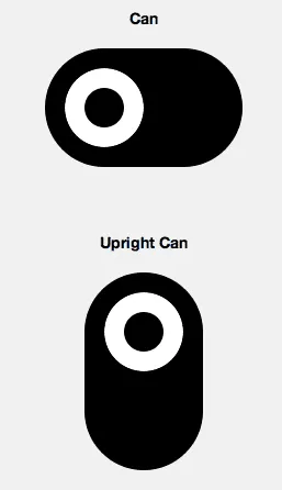
Can & upright can
Variations on the disc and target icons; I found it quite interesting to see what happens when you changes the dimensions of their containers. If it was wider, I think the Can could be used quite effectively as a button.
Eye
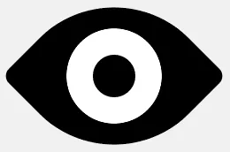
Without a doubt, my favourite of all the icons, it only uses one container and a span within. I had initially tried to use one span for the larger circle shap, two spans for each of the points and another for the ‘pupil’ of the eye. I quickly realised that this was not needed and instead created a box with two very rounded corners, then I rotated it 45 degrees and inserted the inner span for the pupil. Neat huh?
I do intend on exploring this idea further, but I would love to know what everyone’s thoughts and suggestions are; can these be impoved or created using less code..?
See the Pen Pure CSS Icons circa 2010 by Zander Martineau (@mrmartineau) on CodePen.